Doodle
Unifying a fragmented product experience
At the start of 2024, I embarked on a mission to assess Doodle's product landscape and design a solution to address the clear usability issues and multiple inconsistencies within their service offering.
Context
A scheduling and productivity tool with over 30 million monthly active users that needs:
Increase paid subscriptions
Reduce churn
Fix design inconsistencies
Reduce support tickets
Problem
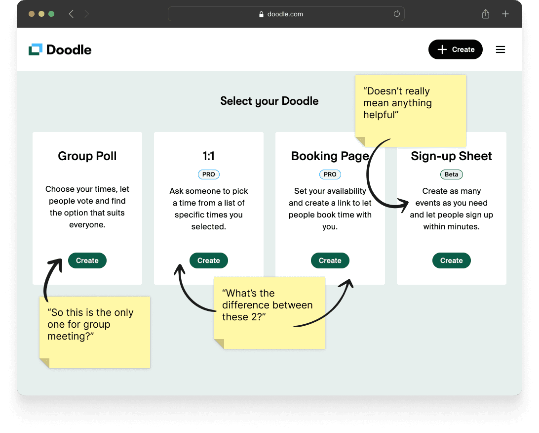
No clear differentiation between scheduling options
Overlapping features
Inconsistent patterns
Outdated look & feel
Discovery
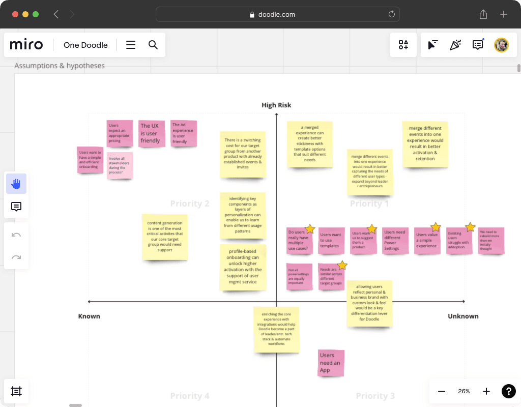
Collaborating
I met with product managers and engineers to discuss:
The assumptions we had built over the years.
The level of confidence and risk for each hypotheses.
Our common knowledge of the problems and possible solutions.
Talking to users
I interviewed several users and support agents and confirmed:
Significant confusion regarding the various meeting types.
Lack of awareness of some valuable features.
Key usability issues
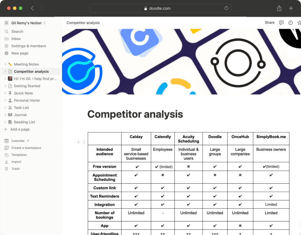
Evaluating the market
What can we learn from competitors?
How can we differentiate our offer?
Testing our copy
I created and organized Tree tests using Optimal Workshop to identify issues with our product naming convention.
What did we learn?
Meeting types (the different ways you can schedule an event) were confusing and misunderstood.
Similar features across meeting types used inconsistent patterns.
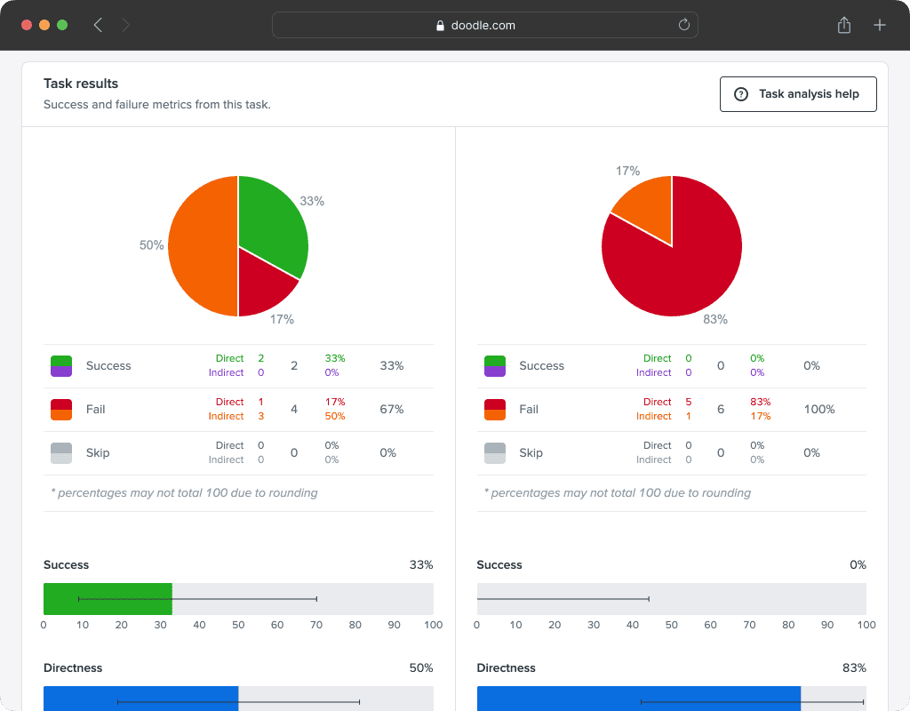
Significant usability issues were confirmed.
Look & feel was perceived as dated and inconsistent.
Mobile experience was poor.
Analysis & Planning
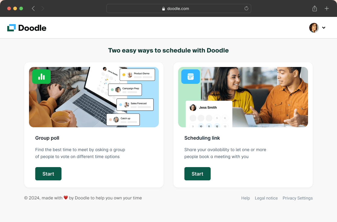
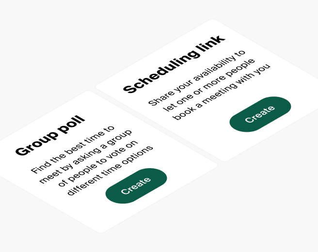
Fixing the "meeting types" problem
Users didn't think in terms of "meeting types".
Doodle meeting type selector options were unclear.
Offering all possible options upfront would be overwhelming and confusing.
The model had to offer a simple and clear choice
Additional options should be offered only when relevant.
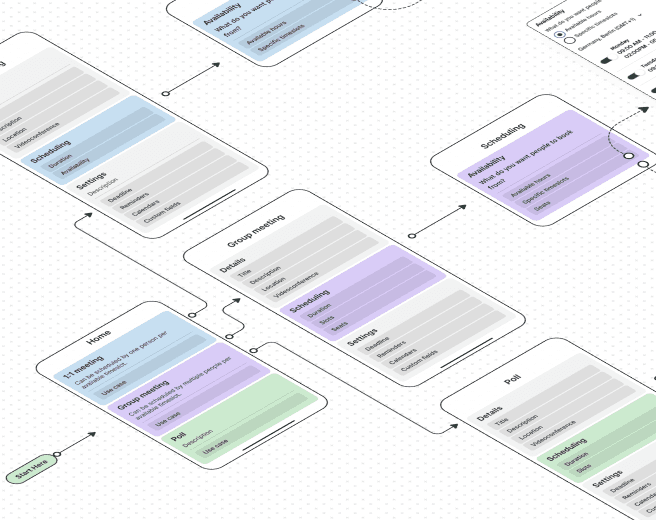
New mental models
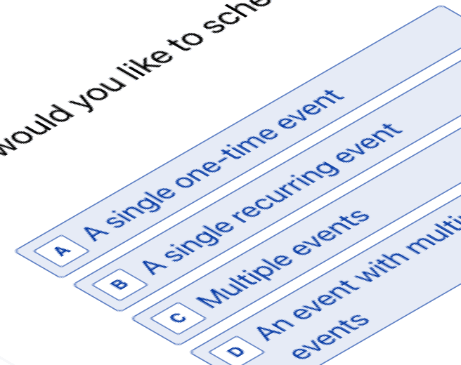
We created 3 options that offered choices combining scheduling methods and/or meeting sizes.
Testing the models
I created Typeform surveys with conditional logic to quickly test the different models.
Results
The simpler model with 2 options was the preferred model.
Defining the scope
I collaborated with our CPO and product owner to create a roadmap that defined:
What features should be included.
What each phase will deliver
How to deliver increasing value to our users
What compromise could be made without impacting quality.
Design
Themes
Drawing from our insights, I defined four guiding themes for our product design explorations:
Clear: Design and copy should unambiguously convey the purpose of each option and what to expect next.
Simple: Users should easily and confidently accomplish their desired tasks.
Discoverable: Functionalities should be easily identifiable, minimizing cognitive load until options become relevant.
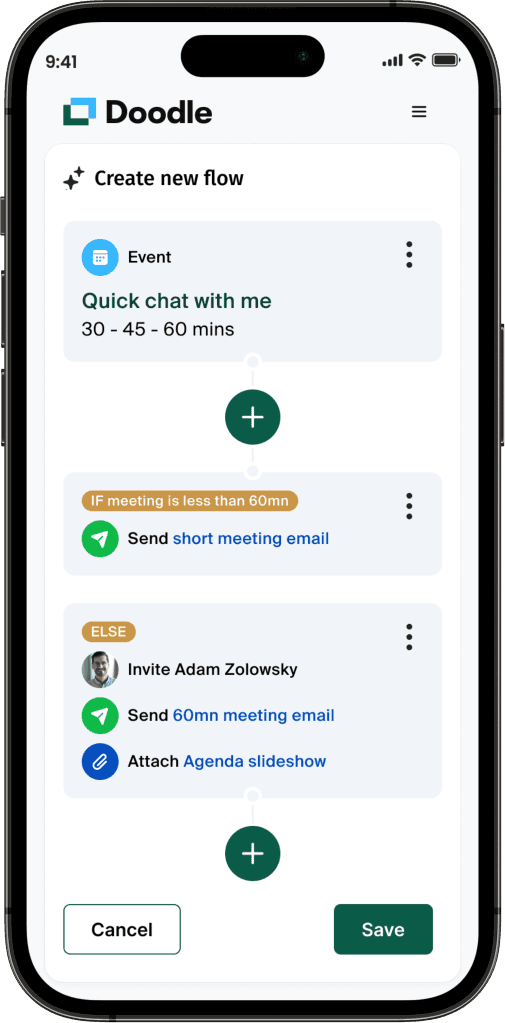
Flexible: The patterns should accommodate all current and future scheduling scenarios, such as recurring events.
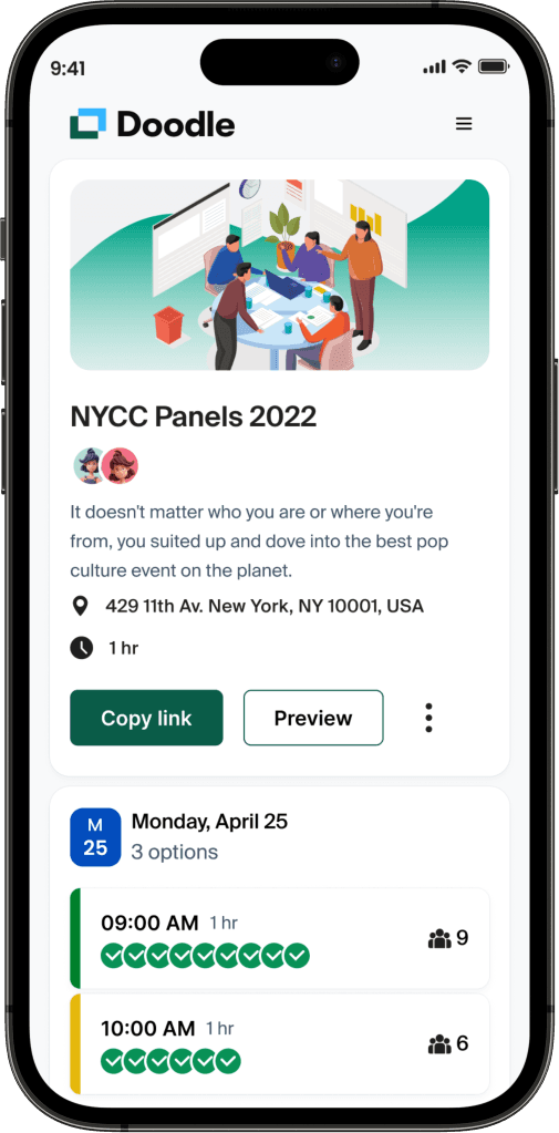
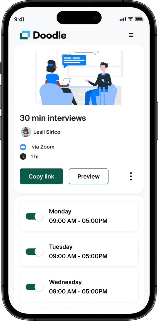
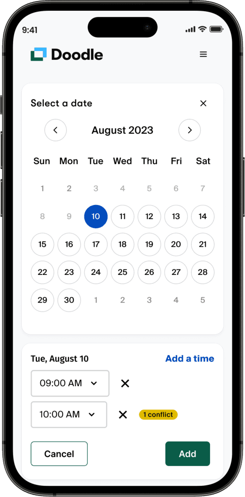
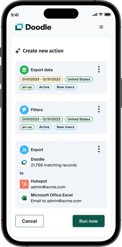
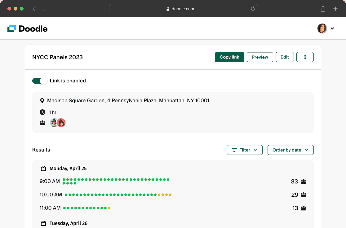
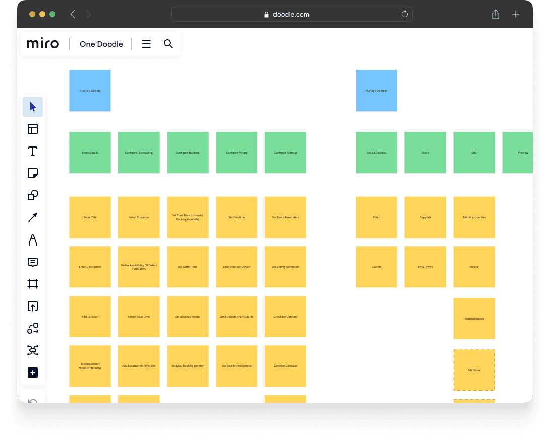
Fixing the inconsistencies
I designed a set of patterns that worked for all meeting types.
I included current and future requirements.
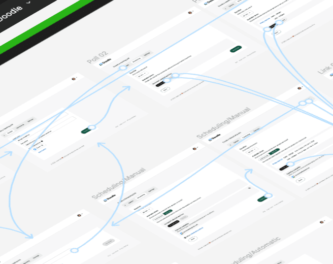
Fixing the usability
I organized usability tests using Figma prototypes.
Observed issues were fixed.
Opportunities for improvements were added.
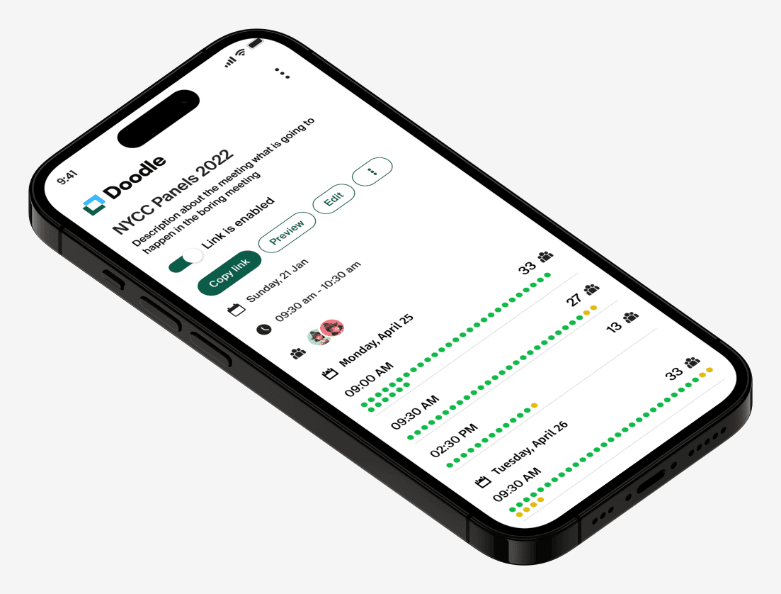
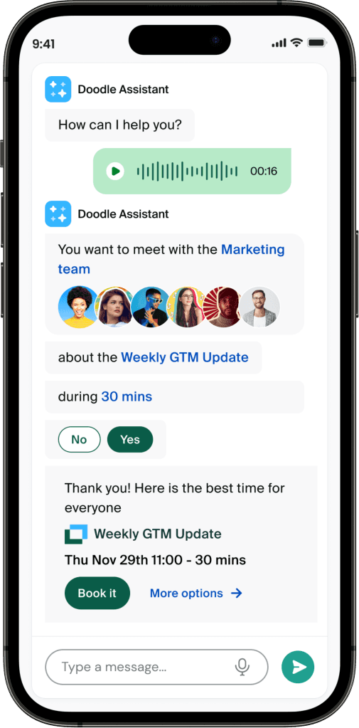
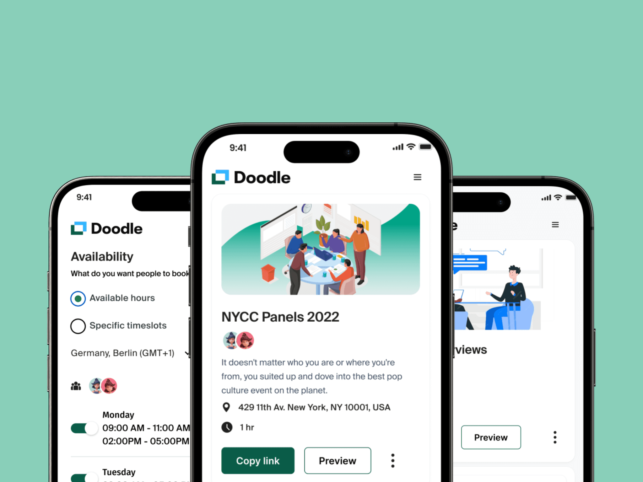
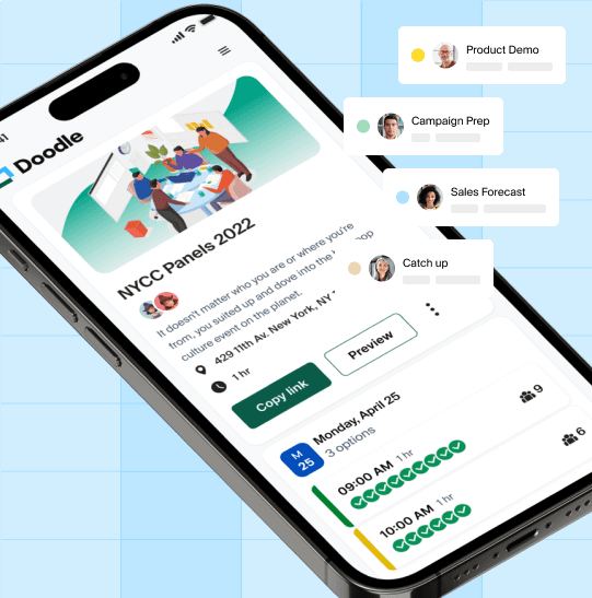
Fixing the mobile experience
Comfortably display all relevant information.
Allow to easily perform all tasks.
Provide clear message and instructions.
Outcome
Termed "One Doodle," this concept was utilized to communicate and define the current product strategy, influencing the direction of the design system at Doodle. By crafting the initial design concept, we communicated a product vision that would guide and support a technically feasible product strategy.