Doodle Growth
How we reached 150% YoY growth of MRR for two consecutive years.
As part of Doodle’s first ever Growth team, I designed the user experience that would help better convert free users into paying customers and support the business model transformation from ad to subscription based.
Doodle Growth
How we reached 150% YoY growth of MRR for two consecutive years.
As part of Doodle’s first ever Growth team, I designed the user experience that would help better convert free users into paying customers and support the business model transformation from ad to subscription based.
Doodle Growth
How we reached 150% YoY growth of MRR for two consecutive years.
As part of Doodle’s first ever Growth team, I designed the user experience that would help better convert free users into paying customers and support the business model transformation from ad to subscription based.
Doodle Growth
How we reached 150% YoY growth of MRR for two consecutive years.
As part of Doodle’s first ever Growth team, I designed the user experience that would help better convert free users into paying customers and support the business model transformation from ad to subscription based.
Context
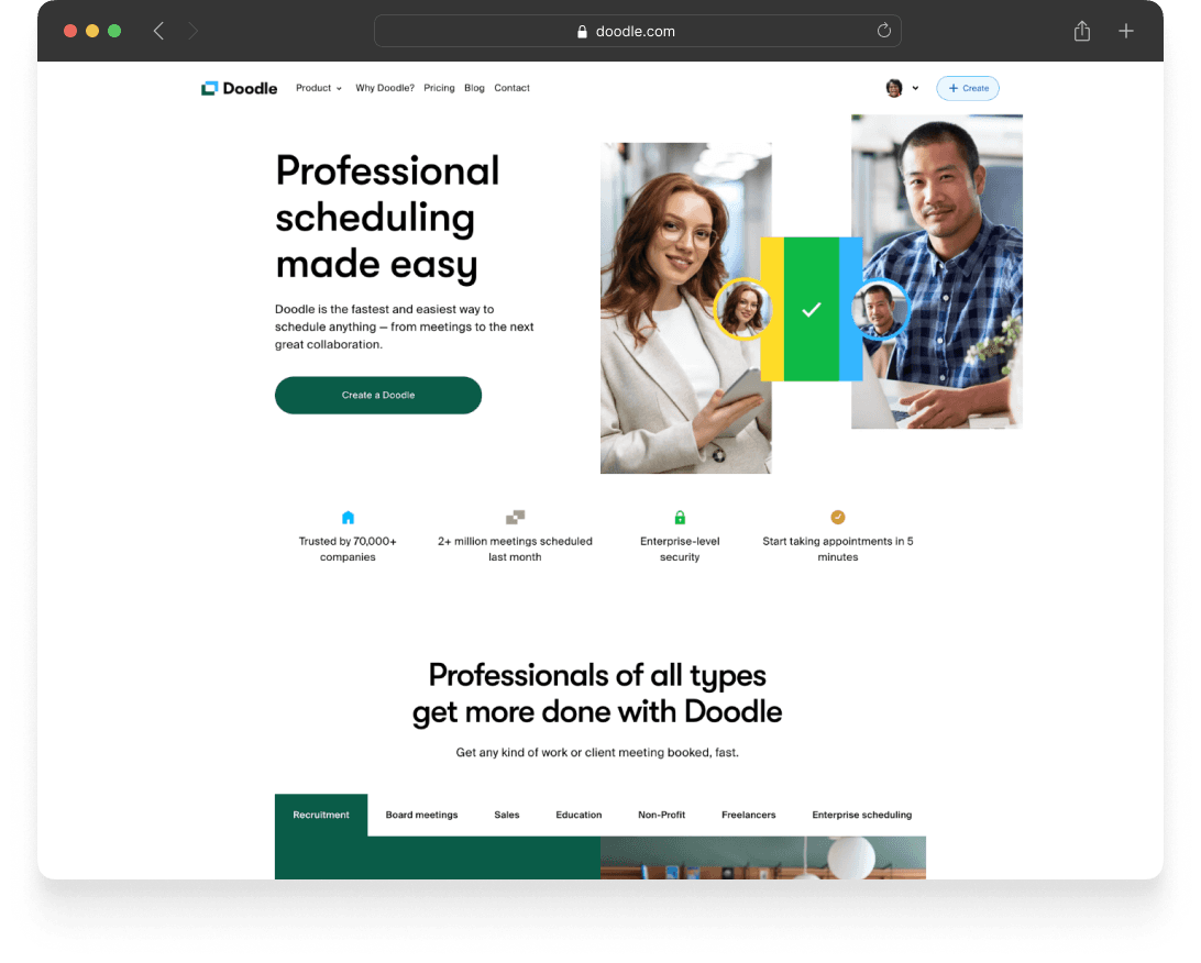
Doodle, a globally recognized productivity tool with over 30 million Monthly Active Users, embarked on a journey to transform from a beloved group scheduling tool into a revenue-generating enterprise solution.
The company was operating primarily on advertising revenue and was lacking a robust subscription model, pricing structure and checkout flow.
Problem
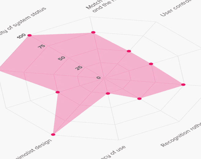
The checkout flow was visually outdated and inconsistent with the recent rebranding of the marketing site.
Heuristic evaluation revealed numerous usability issues.
Limited and unreliable data analytics gave us very little actionable insights.
Context
Doodle, a globally recognized productivity tool with over 30 million Monthly Active Users, embarked on a journey to transform from a beloved group scheduling tool into a revenue-generating enterprise solution.
The company was operating primarily on advertising revenue and was lacking a robust subscription model, pricing structure and checkout flow.
Problem
The checkout flow was visually outdated and inconsistent with the recent rebranding of the marketing site.
Heuristic evaluation revealed numerous usability issues.
Limited and unreliable data analytics gave us very little actionable insights.
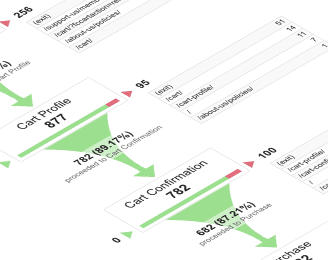
Discovery
Analytics
We identified our key conversion funnels, overhauled our event tracking, A/B testing capabilities and refactored our data taxonomy.
Heuristic analysis
I reviewed the quality and usability of our user experience throughout those key funnels and identified specific problems that we should focus on.
Interviews
I interviewed several internal stakeholders from our customer support to quickly gather knowledge on common user pain points and complaints.
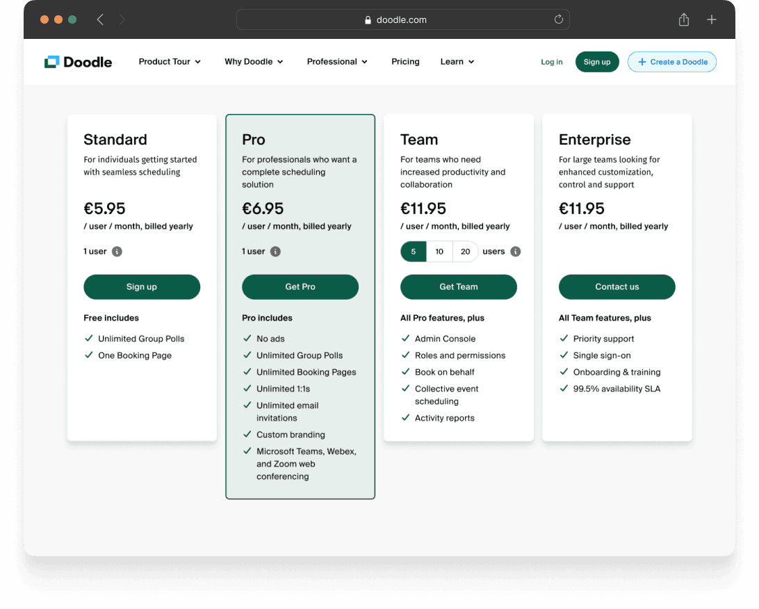
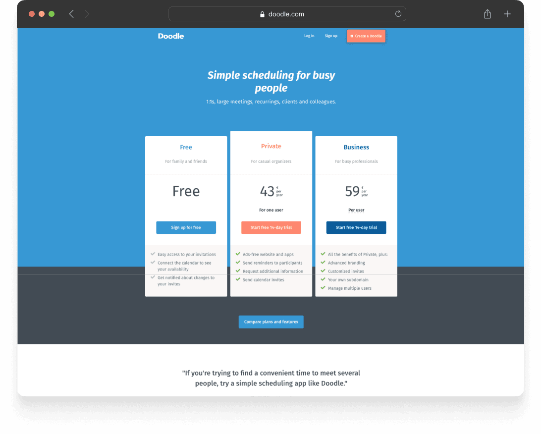
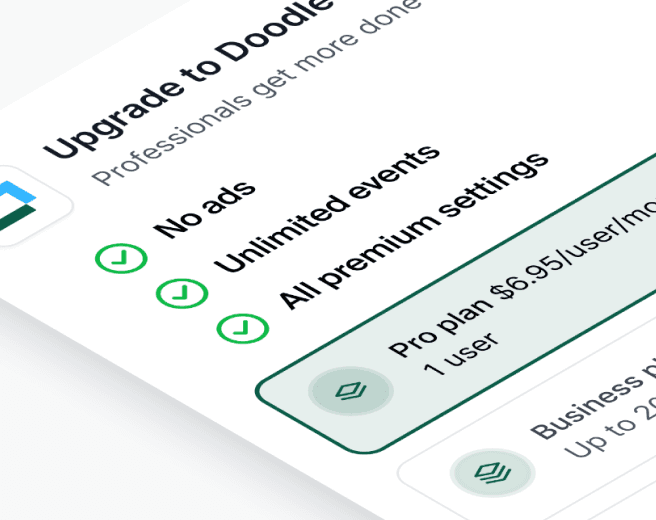
Pricing page
Applying fundamental principles of user-centric psychology and interaction design, I recommended the following changes:
Create a "Standard" plan to leverage the anchoring effect and make the second more expensive plan more appealing.
Make the more profitable plan more visually prominent.
Visually deprioritize the free plan (while monitoring corresponding health metrics to avoid overall negative impact).
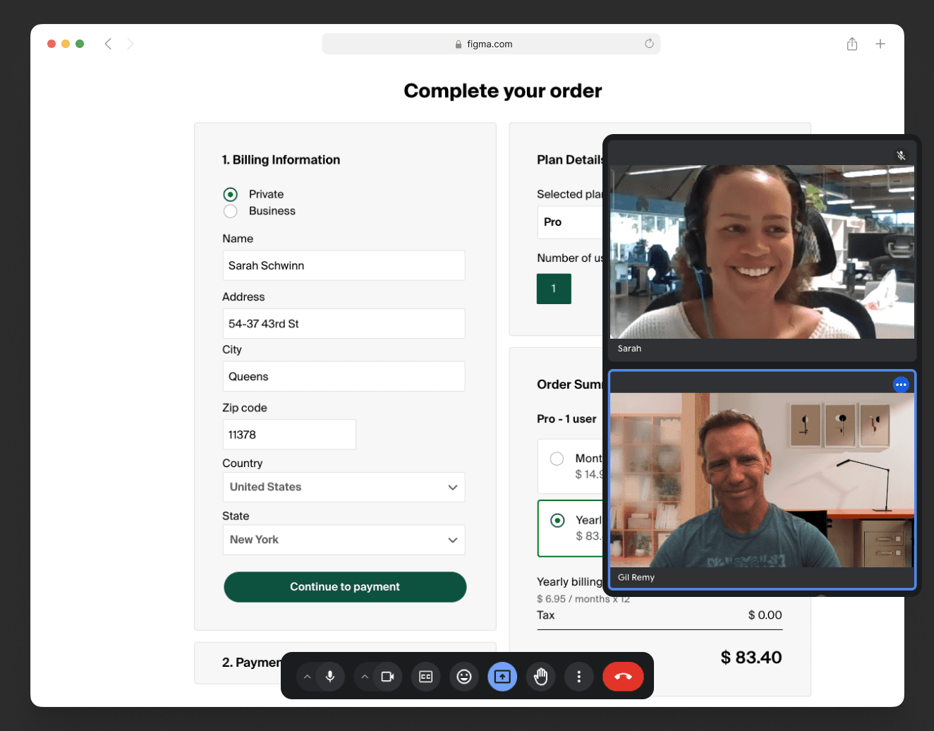
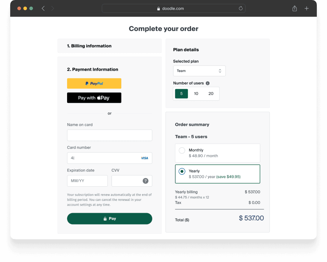
Checkout
In order to reduce friction at the most important step of the funnel, we implemented the following improvements:
Remove non-essential fields from the checkout form
Reduce number of steps to purchase
Provide clear breakdown of the total amount
Show savings from the yearly plan
Include trust signs and security related information
Allow users to change plan and number of users directly in the checkout
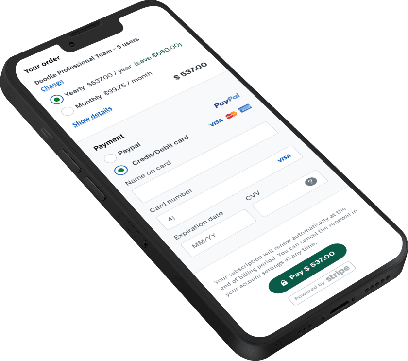
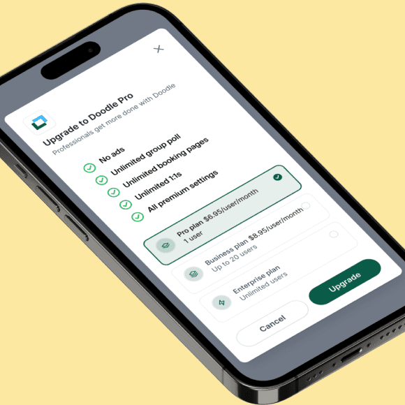
Mobile
Analytics showed that up to 40% of users were using mobile devices.
I set out to provide a clear and simple experience, specifically designed for mobile users, throughout the whole checkout flow.
Mobile
Analytics showed that up to 40% of users were using mobile devices.
I set out to provide a clear and simple experience, specifically designed for mobile users, throughout the whole checkout flow.
Mobile
Analytics showed that up to 40% of users were using mobile devices.
I set out to provide a clear and simple experience, specifically designed for mobile users, throughout the whole checkout flow.
Mobile
Analytics showed that up to 40% of users were using mobile devices.
I set out to provide a clear and simple experience, specifically designed for mobile users, throughout the whole checkout flow.
Other improvements
Hooks & paywalls
We ran A/B tests on a variety of subscription hooks and paywalls in order to find the best performing combination of placement, design and copy across the entire experience.
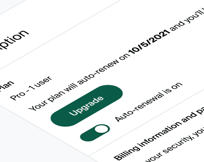
Auto-renewal
In order to ensure a more stable revenue stream, we implemented auto-renewal subscriptions. To limit frustration and backlash from our users, we focused the design efforts on providing a clear and simple experience where the user felt in control of their subscription without unnecessary friction.
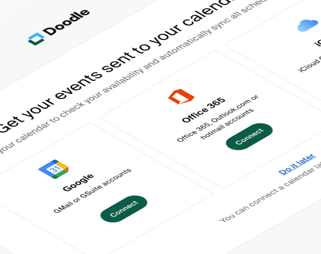
Onboarding
Analytics showed that users who successfully completed certain tasks (connect their calendars, add team members...) churned less on average.
We used the purchase success screen as a starting point to guide them on how to accomplish those tasks.
Other improvements
Hooks & paywalls
We ran A/B tests on a variety of subscription hooks and paywalls in order to find the best performing combination of placement, design and copy across the entire experience.
Auto-renewal
In order to ensure a more stable revenue stream, we implemented auto-renewal subscriptions. To limit frustration and backlash from our users, we focused the design efforts on providing a clear and simple experience where the user felt in control of their subscription without unnecessary friction.
Onboarding
Analytics showed that users who successfully completed certain tasks (connect their calendars, add team members...) churned less on average.
We used the purchase success screen as a starting point to guide them on how to accomplish those tasks.
Winning experiments
Pricing page conversion
Our improvements showed a significant impact in overall conversion as well as in improving the share of the more expensive plan

Start a trial hooks
Placing a persistent "Start a free trial" button in the header combined with various iterations throughout the scheduling flow showed consistent improvement in performance.
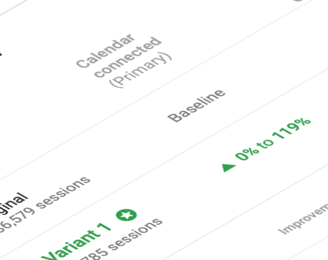
Calendars connected
Taking the time to properly guide our new premium and trial users through the task of connecting their calendars or inviting team members showed great results.

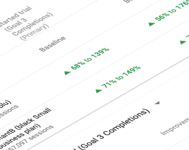
Signup + trial bundle
Including a trial period automatically with every newly created account allowed us to significantly accelerate the growth of our premium user base.
Winning experiments
Pricing page conversion
Our improvements showed a significant impact in overall conversion as well as in improving the share of the more expensive plan
Start a trial hooks
Placing a persistent "Start a free trial" button in the header combined with various iterations throughout the scheduling flow showed consistent improvement in performance.
Calendars connected
Taking the time to properly guide our new premium and trial users through the task of connecting their calendars or inviting team members showed great results.
Signup + trial bundle
Including a trial period automatically with every newly created account allowed us to significantly accelerate the growth of our premium user base.
How our cumulative work impacted the business
Our iterative testing approach and overall initiatives resulted in the tripling of downmarket subscriptions and ensured a +150% YoY growth of MRR for two consecutive years.
+150%
YoY growth of MRR for two consecutive years.
+60%
churn reduction YoY
+20%
Pricing page conversion