IBM
Unified Registration Experience
A series of small changes that made a big impact
IBM
Unified Registration Experience
A series of small changes that made a big impact
IBM
Unified Registration Experience
A series of small changes that made a big impact
IBM
Unified Registration Experience
A series of small changes that made a big impact
Problem
Multiple teams working in siloes and lack of concern for UX optimization resulted in poorly performing registration forms.
Prior to starting our effort, form conversion for IBM top 10 products averaged 20%.
Context
IBM has 1000s of registration forms on its website.
They are used for granting access to Cloud and software trials, downloading software or white papers or just creating an IBM account.
Forms are a central part of IBM digital effort and how they perform is critical to its marketing force.
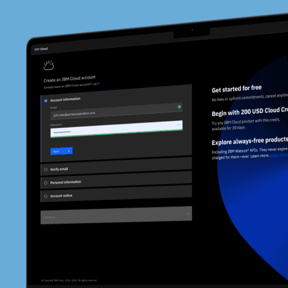
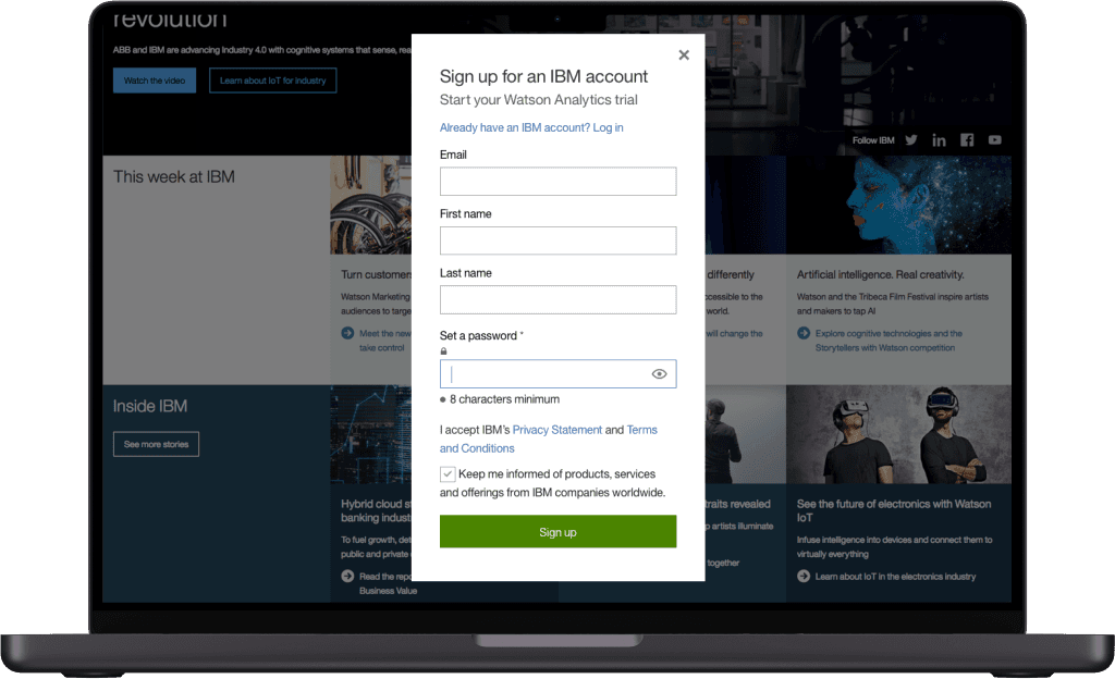
Kill the overlay
The IBM forms used an overlay to display the registration fields.
While this works for login and simple signup forms, it didn't provide enough room to comfortably display a multiple step experience. A full page experience would afford a clearer and more visually comfortable experience.
Another significant challenge associated with overlays is the variety of methods available for dismissing them. These methods include a dedicated button, tapping outside the overlay area, using the browser’s Back button, or employing multiple swipe gestures.
Designers often differ in the choice of dismissal methods they incorporate. This can lead users to inadvertently select the wrong method, resulting in unexpected and potentially costly outcomes.
This single design change showed a 10% conversion jump.

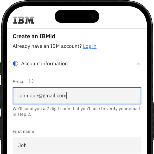
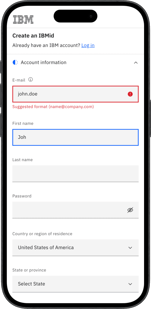
Less work for the user
For every field on the form, we asked “Do we really need this?”. If the answer was yes, we then wondered “Can we get that information without asking the user?”.
Using geolocation based API, we were able to auto-detect country, state, city, company and industry. The rate of error has been, so far, similar to the rate of human error but it allowed us to remove up to 4 fields from the fields. When country had to be displayed for legal reasons, we used the IP lookup to pre-select it for the user. We also used it to preset the country prefix for the phone field.
Implementation of a "Company" type-ahead (similar to suggestive search) field also allowed to reduce user input while ensuring key data was well formatted.
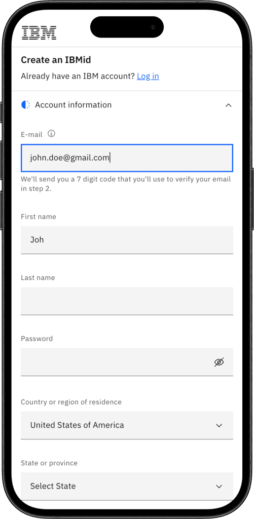
Better email verification
Although we always try to remove all unnecessary friction, email verification at the time of registration was a security requirement for IBM and could not be avoided.
However, we improved the process for the users, by switching from a link sent to their email, to sending them a verification code. While some typing is required, it allows them to continue the experience without dead tabs or environment switch.
A user could easily look up the code on their phone and continue their journey in the original tab.
We discussed the possibility to push any update in validation status to the original tab but this was deemed "out of scope" :-(
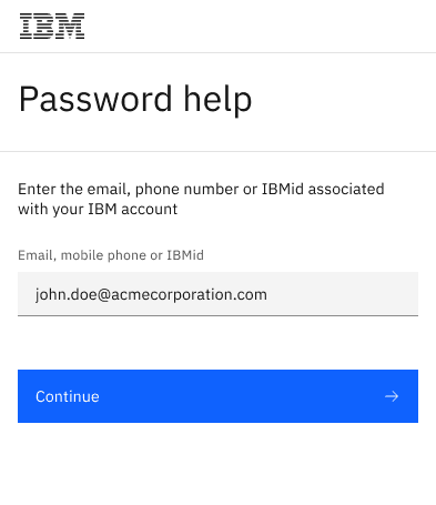
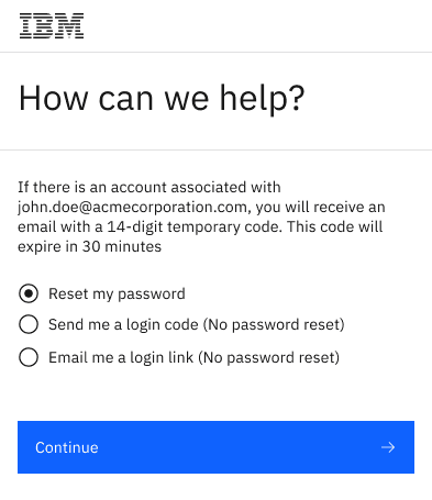
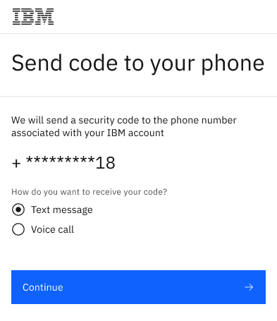
More login options
To reduce drop-offs at the login and password reset stages of the flow, we introduced more options at every step. Users could now choose the option that suited their preferences and needs.
More login options
To reduce drop-offs at the login and password reset stages of the flow, we introduced more options at every step. Users could now choose the option that suited their preferences and needs.
More login options
To reduce drop-offs at the login and password reset stages of the flow, we introduced more options at every step. Users could now choose the option that suited their preferences and needs.
More login options
To reduce drop-offs at the login and password reset stages of the flow, we introduced more options at every step. Users could now choose the option that suited their preferences and needs.
Inline validation done right
We improved the inline validation logic and behavior in all appropriate form fields to reduce the frequency of error messages and resulting user frustration.
Punish late
We showed error messages on blur (loss of focus) to avoid distracting the user as soon as they begin typing.
Reward early
We triggered positive validation (“Check”) on each keystroke to instantly confirm a valid state.
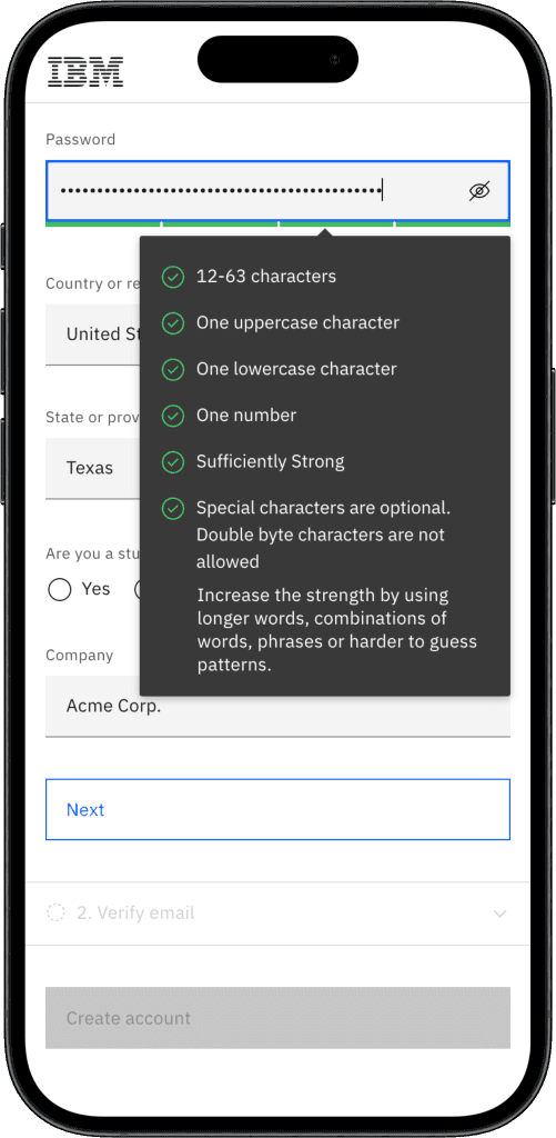
Show the rules
We also surfaced the password rules and showed the satisfied ones on keystroke to clearly show progress.
Inline validation done right
We improved the inline validation logic and behavior in all appropriate form fields to reduce the frequency of error messages and resulting user frustration.
Punish late
We showed error messages on blur (loss of focus) to avoid distracting the user as soon as they begin typing.
Reward early
We triggered positive validation (“Check”) on each keystroke to instantly confirm a valid state.
Show the rules
We also surfaced the password rules and showed the satisfied ones on keystroke to clearly show progress.
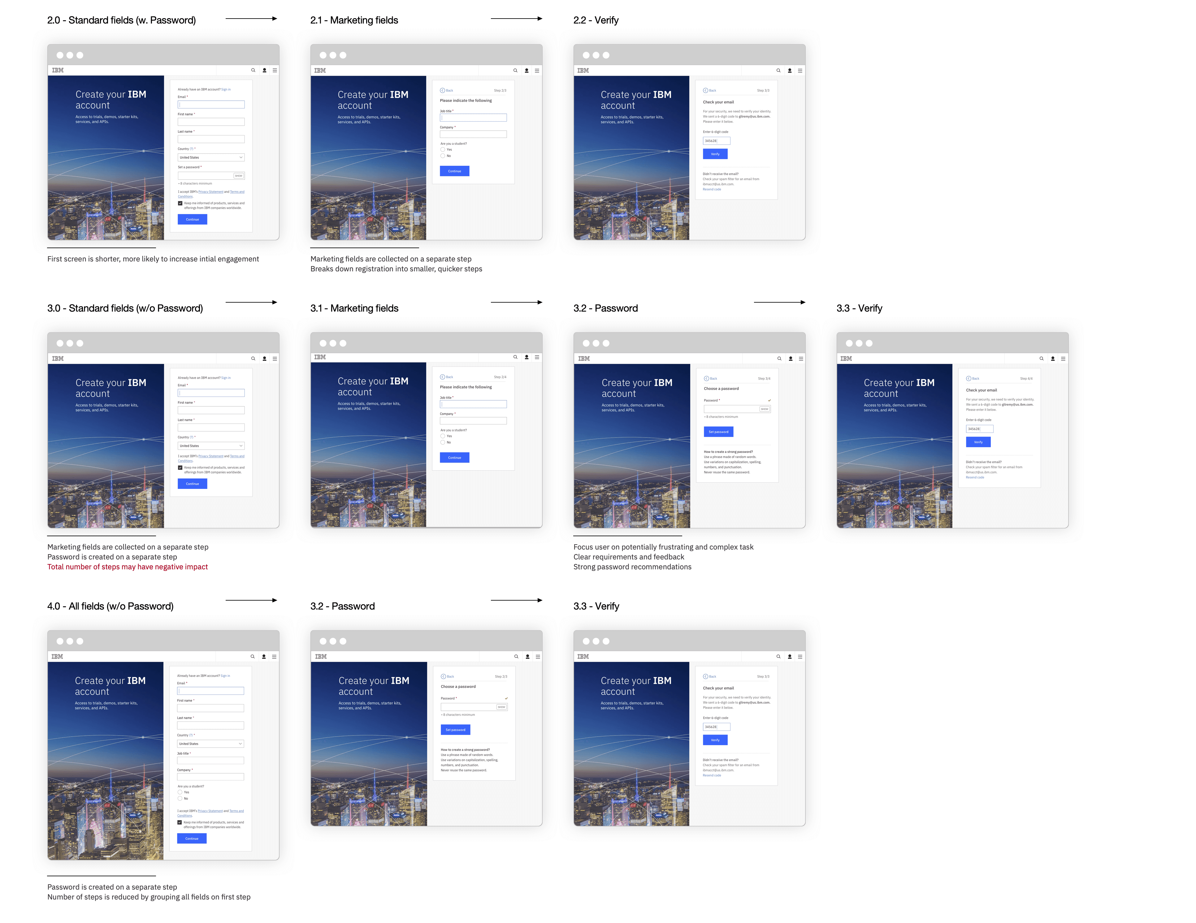
A/B test
In order to determine the best way to split up the registration process. We tested all possible combinations of the following possible steps:
Account fields
Marketing fields
Password creation
Email verification
The flow showing all fields at once, followed by the password creation and email verification performed best and was selected fro implementation.
How did we do?
Conversion increase
+20%
Goal: 10%
Adoption reached
81%
Goal: 51%
Engagement increase
+70%
How did we do?
Conversion increase
+20%
Goal: 10%
Adoption reached
81%
Goal: 51%
Engagement increase
+70%
How did we do?
Conversion increase
+20%
Goal: 10%
Adoption reached
81%
Goal: 51%
Engagement increase
+70%
How did we do?
Conversion increase
+20%
Goal: 10%
Adoption reached
81%
Goal: 51%
Engagement increase